Objective:
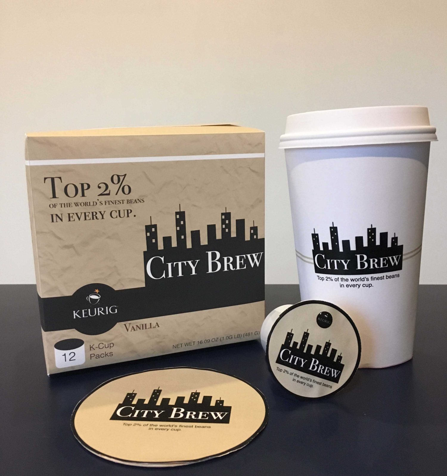
For this project, we had to pick a random coffee house out of a hat and rebrand them completely. We also had to work with a partner for this project. My partner was Jared Winslow. We picked out City Brew. We worked together on researching City Brew, redesigning their logo, color palette, and a new target audience to design and market towards. We also had to figure out a new value proposition for City Brew, too. By the end of this project, we needed to have a Keurig box, K-cup, coffee cup, and coaster designed for the coffee shop.
City Brew Background:
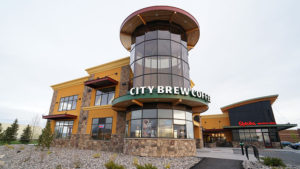
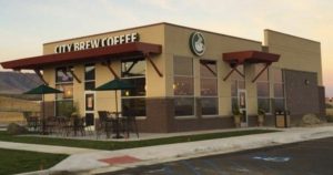
City Brew is a small coffee shop with multiple locations in Montana. This coffee shop didn’t have a specific target persona, so after doing some research on the coffee shop location we decided to target college students specifically. Before sketching, my partner and I gathered a good amount of research to fully understand where this coffee shop was located. We found out City Brew was located in Billings, Montana which is in the middle of a big city right next to Montana State University. Knowing the location and surrounding area of the coffee shop enabled us to target a specific persona and create a new brand identity.
Sketches/Logo Renditions:
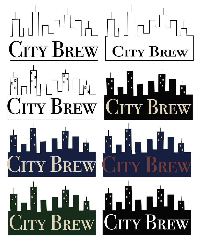
Before, bringing our designs in digitally, we first put pencil to paper. We noticed their original logo looked a lot like Starbucks‘ so we really wanted to step away from that. While in the process of sketching, I aggregated content from Pinterest and created a mood board for some inspiration.
Color Palette:
We also noticed the colors in the original City Brew logo were exactly like the green and white Starbucks uses in their logo. From the very first time we saw their logo, we knew we wanted to recreate the logo and the color palette to have warm, earthy tones since there are mountains in Montana.
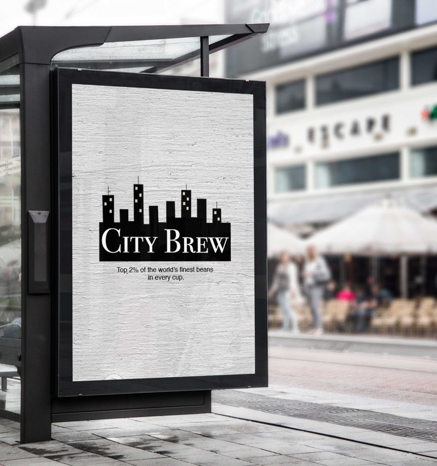
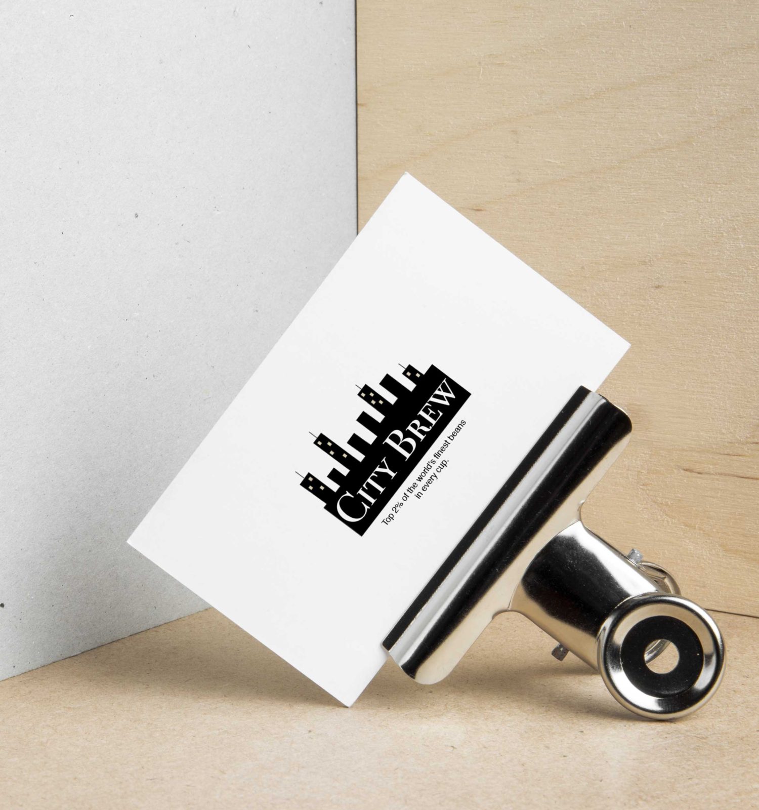
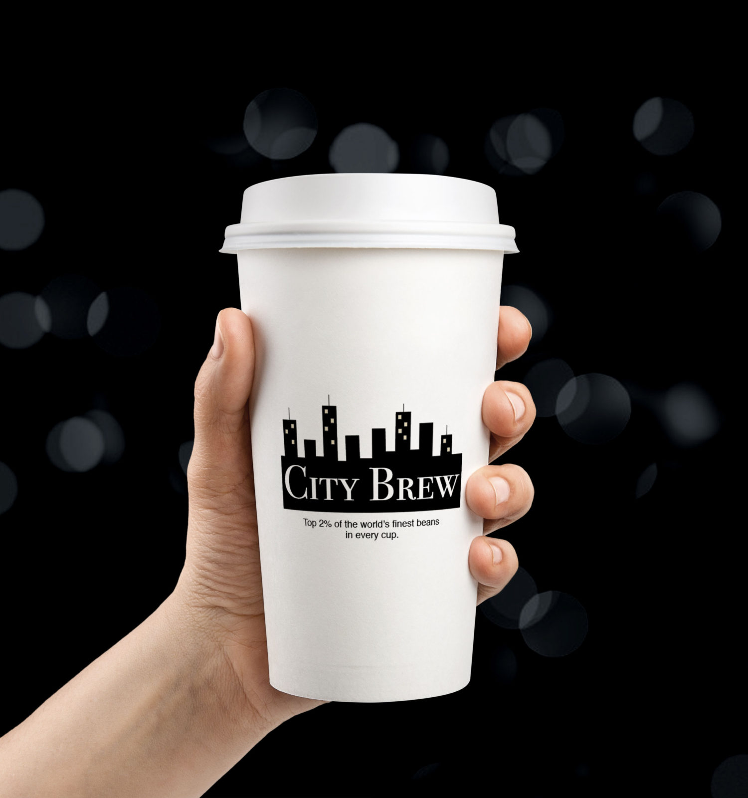
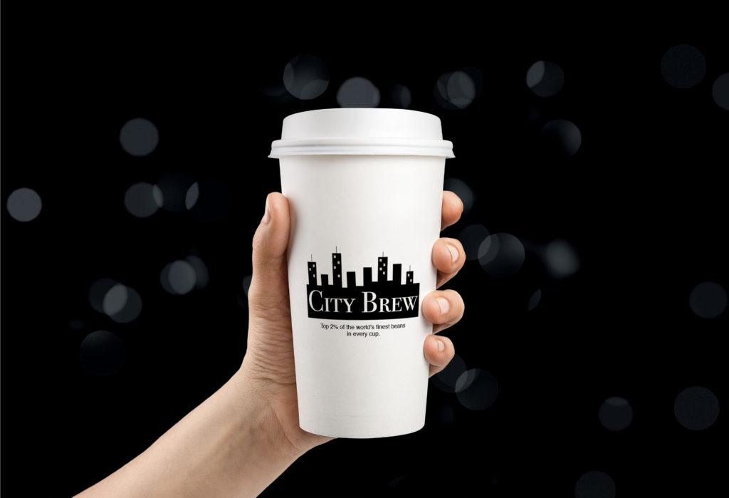
Final Logo Design:
After sketching several possible logos, we narrowed it down to this one below. We decided to stick with the gold, white, and black for the final logo to give it a real classy, sleek, and modern look.